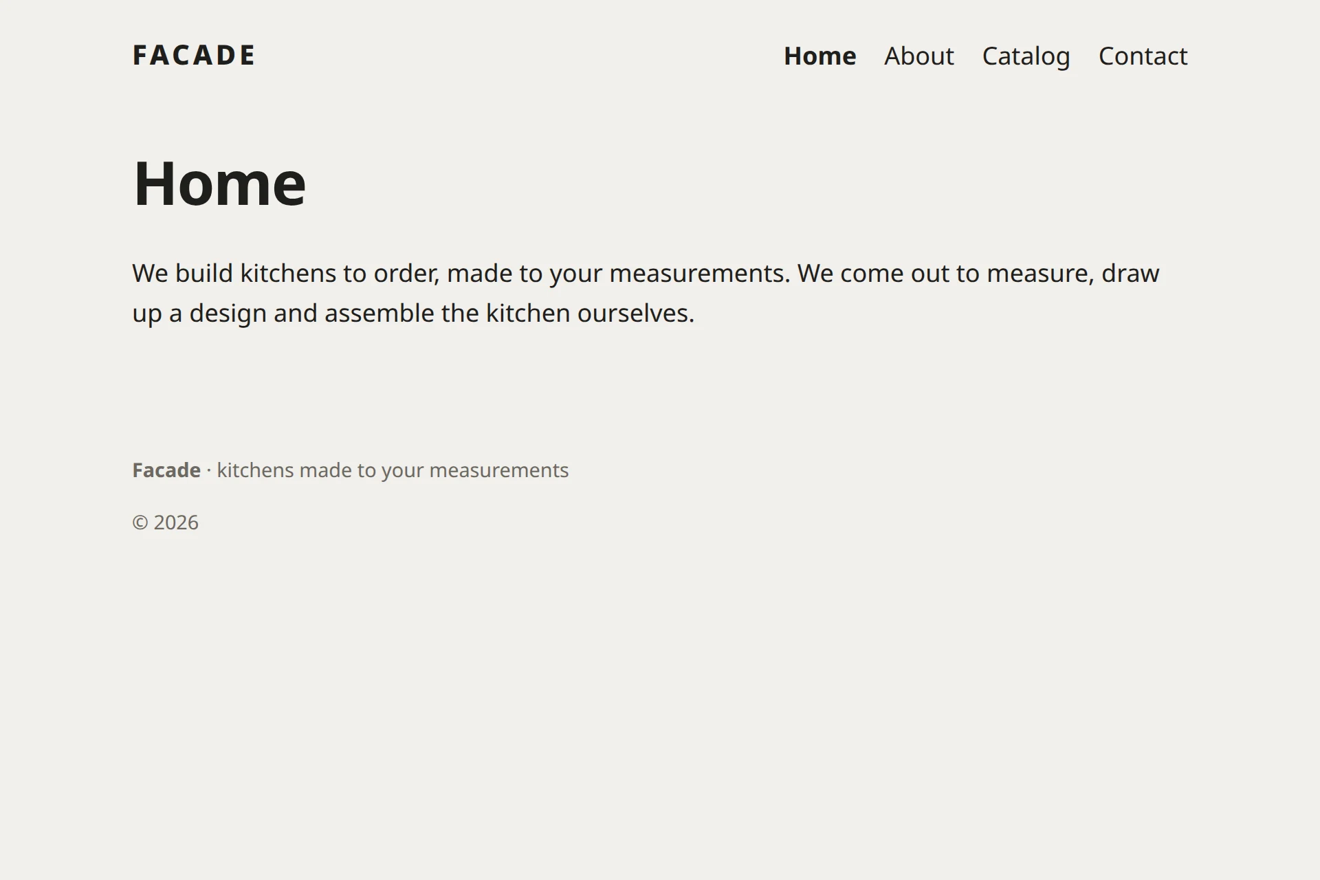
Components: header, menu and footer
It’s handy to keep the header and the footer as separate pieces that you can plug into any template. These pieces are called components. We’ll make three: a menu, a header and a footer.
Why components
Soon the site will have other templates: for kitchens, for the catalog, for projects. Every one of them needs the header and footer. If you copy them into each template, then changing the phone number in the footer means editing five places without missing one.
A component solves this. You write the header once and plug it in with one line. Change the component, and every template gets the new header.
A menu from the tree
Let’s start with the menu. It should show the top-level pages and update itself when you add a page. Create a component: on the Elements tab, click + next to the word “Components” and type the name Nav.
<!-- @component
Site menu: top-level pages.
-->
<script>
  import { children, current, link } from '$core';

  const here = current();
  const items = children(null);
</script>

<nav class="nav">
  {#each items as item (item.id)}
    <a
      href={link(item.id)}
      aria-current={here?.id === item.id ? 'page' : undefined}
    >
      {item.menuTitle || item.title}
    </a>
  {/each}
</nav>

<style>
  .nav {
    display: flex;
    flex-wrap: wrap;
    gap: 0.5rem 1.25rem;
  }

  .nav a {
    color: inherit;
    text-decoration: none;
  }

  .nav a[aria-current] {
    font-weight: 700;
  }
</style>
Here’s what happens in it:
<!-- @component … -->: the component’s description. The manager shows it next to the name, and a month from now it will remind you what the component is for.import { children, current, link } from '$core';: takes three functions from$core.$coreis the module that templates and components use to get the site’s data.children(null): the top-level pages, in the order they stand in the tree. Pass a page id instead ofnullto get that page’s children.link(item.id): the address of a page by its number. Rename the page, and the link changes by itself.current(): the page the visitor is looking at right now. We compare numbers to mark the current menu item, and it turns bold.(item.id)afteras item: the key of a list item. Svelte uses it to tell the items apart.
The header
Now a new component, Header:
<!-- @component
Header: site name and menu.
-->
<script>
  import Nav from '$components/Nav';
  import { site } from '$core';
</script>

<header class="header">
  <a class="logo" href="/">{site().name}</a>
  <Nav />
</header>

<style>
  .header {
    display: flex;
    flex-wrap: wrap;
    align-items: baseline;
    justify-content: space-between;
    gap: 1rem;
    max-width: 48rem;
    margin: 0 auto;
    padding: 1.5rem;
  }

  .logo {
    color: inherit;
    font-size: 1.25rem;
    font-weight: 800;
    letter-spacing: 0.12em;
    text-transform: uppercase;
    text-decoration: none;
  }
</style>
A component plugs in another component the same way a template does: import Nav from '$components/Nav'; and then <Nav />. We get the site name with site().name: a component doesn’t receive site as a parameter, so it asks $core for it.
A footer with a parameter
The footer will have a parameter: the line next to the name. This way one component can look different in different templates.
<!-- @component
Footer: name, a line about the studio and the year.
-->
<script>
  import { site } from '$core';

  let {
    /** Line next to the name */
    note = 'kitchens made to order',
  } = $props();

  const year = new Date().getFullYear();
</script>

<footer class="footer">
  <p><b>{site().name}</b> · {note}</p>
  <p>© {year}</p>
</footer>

<style>
  .footer {
    max-width: 48rem;
    margin: 0 auto;
    padding: 1.5rem;
    color: #6b6862;
    font-size: 0.9rem;
  }
</style>
A component receives parameters through $props(), the same way a template receives page. The value after the = sign is the default: if nobody passes the parameter, the footer says “kitchens made to order”. The manager shows the /** … */ comment above the parameter as a hint.
Build the template from components
Now the Base template gets shorter. Replace all of its code:
<script>
  import Content from '$core/Content';
  import Footer from '$components/Footer';
  import Header from '$components/Header';

  let { page, site } = $props();
</script>

<svelte:head>
  <title>{page.longTitle || page.title} — {site.name}</title>
</svelte:head>

<Header />

<main>
  <h1>{page.longTitle || page.title}</h1>
  <Content of={page} />
</main>

<Footer note="kitchens made to your measurements" />

<style>
  :global(body) {
    margin: 0;
    background: #f1efeb;
    color: #1f1e1c;
    font: 18px/1.6 system-ui, sans-serif;
  }

  main {
    max-width: 48rem;
    margin: 0 auto;
    padding: 0 1.5rem 2rem;
  }

  h1 {
    font-size: 2.75rem;
    line-height: 1.05;
    letter-spacing: -0.02em;
  }
</style>
We passed our own line to the footer: <Footer note="kitchens made to your measurements" />. You write parameters like tag attributes.